Top 10 Web Design Mistakes Small Businesses Still Make in 2025
- CodeMasters Marketing

- Jul 7, 2025
- 10 min read

Your website is your most powerful sales tool. But in 2025, we’re still seeing the same design mistakes that cost small businesses leads, trust, and revenue. And we're not talking about subjective design tastes, these are hard-hitting errors that directly affect conversions, mobile usability, SEO, and credibility.
If you’re investing in a website this year (or wondering why yours isn’t performing), this post breaks down the top 10 web design mistakes holding small businesses back, with examples, real consequences, and how to fix them.
1. Your Website Isn’t Mobile-Friendly (Yes, Still)
It’s 2025. Over 70% of all website traffic is mobile-first according to Statista, and yet too many small businesses are still relying on websites that either break, shrink awkwardly, or become unreadable on mobile screens.
This isn't just a poor user experience, it's killing your SEO. Google prioritizes mobile-friendly websites in its ranking algorithm. If your website isn't responsive, you’re actively losing both visibility and potential leads.
What it looks like:
Symptom | Impact |
Pinch-to-zoom required to read | High bounce rate |
Menus disappear or break | Navigation frustration |
Buttons too small to tap | Missed conversions |
Fix it:
Start by running your website through Google’s Mobile-Friendly Test, it’ll show exactly what’s breaking. But don’t stop there.
Make sure your layout is fully responsive, not just “shrink-to-fit.” That means:
Navigation collapses into a clean mobile menu (hamburger or bottom nav)
Font sizes adjust dynamically (use rem units instead of px)
Images use max-width: 100% and height: auto to avoid overflow
Clickable elements (buttons, forms) are at least 48x48 pixels for easy tapping (per WCAG)
Test across devices using Chrome DevTools’ mobile view or using our tool if possible
If you're using Wix or WordPress, look for themes or templates that are mobile-first, not just “mobile-compatible.” Better yet, get a fully custom responsive layout tailored to your actual users.
Also worth reading: Is Your B2B Web Design Effective? Here’s How to Tell
2. You’re Still Using DIY Builders Without a Strategy
There’s nothing wrong with Wix, Squarespace, or Shopify when used right, but too often small businesses rely on templates without thinking through structure, hierarchy, or conversion goals.
Your site might look “nice” but that doesn’t mean it’s effective.
What goes wrong:
Mistake | Consequence |
Homepage has no clear CTA | Visitors leave without taking action |
SEO basics ignored (meta tags, H1s) | You don’t rank for anything |
Generic stock images everywhere | Lack of trust and brand connection |
Fix it:
If you used a DIY website builder (Wix, Squarespace, Shopify), but didn’t map out your site structure, you’re not getting results. Here's how to fix that:
Define your goal for each page. Is it booking a consult? Making a sale? Getting a call?
Create a site map that reflects that journey: home → service page → lead magnet → contact page.
Use a clear H1–H3 hierarchy per page to structure content for both users and SEO.
Strip down your homepage to one offer and one call to action.
Also, avoid adding dozens of unnecessary pages (like “Gallery,” “Our Team,” etc.) unless they serve a lead generation purpose.
Want to see how this affects pricing? Here’s our breakdown: How Much Does a Website Cost in Canada (2025)
3. Your Website Loads Too Slowly
Speed is no longer a “nice to have.” In 2025, it’s a ranking factor and a conversion killer if neglected.
According to Google, the ideal load time is under 2.5 seconds. Yet many small business sites still take 5+ seconds to load due to bloated images, unnecessary scripts, or cheap hosting.
Real consequences:
Load Time | Bounce Rate |
1–3 seconds | 32% |
3–5 seconds | 90%+ |
Over 6 seconds | 120%+ |
(Source: Google/SOASTA Research)
Common issues:
No image compression
No lazy loading for offscreen assets
Hosting on low-tier servers
Fix it:
Don’t just run a PageSpeed test, interpret the results. Focus on the issues that matter most:
Images: Re-export large JPEGs as WebP or compressed PNGs. Use TinyPNG before upload.
Fonts: Don’t load 5 different weights and styles. Use only the variants you need (e.g. Regular, Bold).
Scripts: Disable unused plugins/scripts. Defer third-party scripts like chat widgets or heatmaps.
Hosting: Don’t use bargain hosting plans. Sites on SiteGround, Kinsta, or Velo by Wix Studio run faster than budget shared hosts.
Bonus: Use lazy loading (loading="lazy") for images and videos to delay offscreen assets.
4. Your CTAs Are Confusing or Missing

Your website should make it blindingly obvious what the visitor should do next: call, book, download, or buy.
Yet we see sites with:
No visible CTA above the fold
Generic “Learn More” buttons that go nowhere
3+ conflicting CTAs on the same page
The result? Users leave.
Examples of poor vs. strong CTAs:
Weak CTA | Strong CTA |
“Submit” | “Get Your Free Quote Now” |
“Click Here” | “Book a 15-Minute Strategy Call” |
Hidden below the fold | Button placed prominently in hero section |
Fix it:
Audit every page for these questions:
What is the main goal of this page?
Is that goal supported by a single, clear CTA?
Is the CTA above the fold and repeated mid-page and at the bottom?
Make your call to action benefit-driven, not generic. Instead of “Learn More,” use:
“Get Your Free Lighting Audit”
“See Pricing Packages”
“Book a 15-Minute Discovery Call”
Place your CTAs where people expect them: top right, hero section, and after benefits sections. Use visual contrast (color and spacing) to make the CTA button stand out.
For help restructuring your funnels, explore our landing page design service, we design pages that convert.
5. Your Design Looks Like It’s from 2015
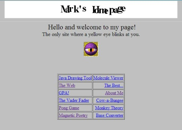
Design trends change. A site built even five years ago can now feel dated, untrustworthy, or outright abandoned, even if the content is current.
Outdated visual cues include:
Sliders or carousels that never get clicked
Drop shadows and bevels everywhere
Cluttered sidebars and hard-to-read fonts
Full-width background videos that autoplay with sound
Users judge design in 0.05 seconds (Google Research). If your brand feels behind the times, they assume your business is too.
Fix it:
Your website design should reflect today’s standards:
Ditch carousels — they’re low-conversion and rarely get past the first slide
Use white space generously — it increases comprehension and focus
Avoid shadows, gradients, and bevels unless used subtly for layering
Choose a modern font stack like Inter, Poppins, or Open Sans — and stick to 2 fonts max
Integrate subtle asymmetry or organic shapes for a more current visual tone. See our blog on 2025 design trends
Before redesigning, look at top competitors in your industry. What do their sites look like today? If yours feels outdated in comparison, a website redesign can do more than improve aesthetics, it boosts user confidence and conversions.
6. You Ignore Accessibility Standards
In 2025, not prioritizing accessibility isn’t just a UX issue, it’s a legal risk and a reputation liability. Plus, accessibility boosts SEO, since accessible websites are more structured, semantic, and user-friendly.
Common issues:
Low contrast between text and background
No alt text on images
Missing form labels
Navigation unusable by keyboard
Why it matters:
Accessibility Issue | Who It Affects |
No screen reader support | Visually impaired users |
Tiny buttons and menus | Motor-impaired or mobile users |
Complex menus | Users with cognitive disabilities |
Fix it:
Start with contrast and readability. Use a contrast ratio of at least 4.5:1 between text and background (check with WebAIM’s Contrast Checker).
Next, review:
Alt text for every image. Describe the content, not just “image1.jpg.”
Keyboard navigation: Try tabbing through your site. Can you reach every link, form, and menu?
Form labels: Every input should have a <label> or ARIA attribute.
Semantic HTML: Use <header>, <nav>, <main>, <footer>, not just <div> soup.
Test with WAVE or axe DevTools. Then set a goal to meet WCAG 2.1 AA standards, that’s the level expected for most public-facing websites today.
We also broke this down in detail in our guide: Designing a Website for Accessibility
7. Your Content Is Written for You, Not Your Users
Too many small businesses fall into the trap of talking about themselves, not the user’s needs, problems, and desired outcomes.
Bad examples:
“We’re a family-run business with over 20 years of experience.”
“Welcome to our homepage.”
“We offer quality services at affordable prices.”
That says nothing about the customer.
Fix it:
Rewrite every page to start with your customer’s pain point, not your company’s bio. Your homepage isn’t about you. It’s about:
The problem your visitor has
The solution you offer
Why they should trust you to solve it
Use the “you” language 3x more than “we.” Here’s a quick check:
Phrase | Rewrite It As |
“We have 20+ years of experience” | “You get a team with 20+ years solving this exact problem” |
“We build websites” | “You’ll get a site that loads fast, ranks higher, and converts more” |
For CTAs, lead with outcomes. Example: “Book Your Free Strategy Call” instead of “Schedule Meeting.”
For a deeper look at how web design and messaging align, read The Importance of Web Design in Digital Marketing.
8. You’re Still Ignoring SEO Fundamentals
Even in 2025, we still see business websites with:
No meta titles or descriptions
H1 used multiple times or not at all
No internal linking structure
URLs like www.example.com/page1 or untitled.html
If Google can’t understand your site’s structure, it won’t rank it. SEO starts with your design and layout, not after launch.
Quick SEO audit checklist:
Element | SEO Impact |
Meta title & description | Affects CTR in search results |
H1–H3 hierarchy | Helps Google understand content |
Image alt text | Contributes to image SEO + access. |
Internal links | Keeps users engaged; improves crawl |
Fix it:
Start with a basic on-page SEO audit:
Meta titles: 55–60 characters, include your primary keyword
Meta descriptions: 155–165 characters, entice clicks
H1 structure: Only 1 H1 per page. Use H2s/H3s for sections.
Image alt text: Descriptive and keyword-relevant
URLs: Clean and keyword-rich (e.g., /web-design-services, not /page-6)
Internal links: Link to related blog posts, service pages, and FAQs
Then layer in schema markup like FAQ, Breadcrumb, and LocalBusiness. If you’re unsure how, we can help, SEO is part of our website design process, not an afterthought.
Or for a deeper breakdown: Understanding and Converting PX to REM in Web Design, a technical SEO trick that improves accessibility and rankings.
9. You Have Zero Trust Signals on Your Site
Users decide within seconds whether they trust you — and most small business websites do nothing to reinforce credibility.
Missing elements include:
Testimonials or case studies
Security badges or privacy policies
Contact info in the footer
Portfolio or examples of past work
What builds trust fast:
Trust Signal | Why It Matters |
Google Reviews / Testimonials | Social proof + relevance |
Clear Contact Info | Transparency + reliability |
Client Logos or Case Studies | Shows you’re legit and experienced |
Fix it:
Build social proof and credibility directly into your site layout:
Add a testimonial block above the fold on your homepage
Use real names and headshots (or company names/logos) for credibility
Include a “Featured In” or “Trusted By” section with media or partner logos
Make your contact info visible in both the header and footer
Add a dedicated Reviews page linked from the main nav
Here’s a smart structure:
Home Page
├── Why Us / Our Process
├── Case Studies
├── Testimonials
└── Contact Page (with reviews and trust badges)
Don’t forget third-party reviews (Google, Clutch, etc.) embed them using real widgets, not screenshots.
Want examples? See how we do it across our contact and service pages at CodeMasters.
10. You Never Update or Maintain Your Website
Launching your site isn’t the end, it’s the beginning. A site left untouched for months will:
Drop in rankings
Break due to plugin conflicts
Lose users due to outdated info
This is especially common for small businesses that built a site years ago and haven’t touched it since.
Fix it:
Set up a monthly website maintenance checklist:
Check for broken links using Ahrefs Broken Link Checker
Run Google PageSpeed + Mobile tests
Review Google Search Console for crawl errors
Update any expired content (especially blog posts or events)
Back up your site and update plugins if using WordPress
If you run seasonal promotions, rotate banners and CTAs accordingly. If your business has changed, reflect that in the site (e.g., new team members, new offers, or pricing updates).
The goal: treat your website like a living asset, not a static one. If you don’t have time to maintain it, consider outsourcing to a professional website maintenance service.
Conclusion: Don’t Let Your Website Hold You Back
Your website should be your hardest-working sales rep — not a static brochure that repels customers.
If you recognized even two or three of these mistakes on your site, it’s time to take action. These aren’t just design choices — they directly affect your sales, reputation, and Google ranking.
Need a fresh set of expert eyes on your site? Contact CodeMasters for a strategy session — we’ll walk you through what’s working, what’s not, and what will actually grow your business.
Frequently Asked Questions
What are the most important pages every small business website should have?
At minimum: a strong homepage, clear service or product pages, an about page, a contact page, and a privacy policy. Adding testimonials, a blog, and a dedicated landing page for lead generation can significantly increase trust and conversions.
How often should I update my website content?
At least once a quarter. Update your homepage offers, add new blog content, and revise outdated info. Google rewards freshness — and your audience expects relevancy.
Do web design mistakes really impact SEO rankings?
Yes. Poor mobile responsiveness, slow load speeds, broken layouts, and improper HTML structure directly affect crawlability, bounce rate, and ranking signals. Good design is part of technical SEO.
How much should a small business expect to spend on a professional website in 2025?
In Canada, expect to invest between $2,500 to $10,000 CAD, depending on features, content strategy, and custom design needs. You can see a full breakdown here: How Much Does a Website Cost in Canada (2025)
Is using a template bad for SEO or conversions?
Not necessarily. The issue isn’t the template — it’s failing to customize it properly. Generic templates often lack strong hierarchy, load slowly, or miss conversion strategy. Always tailor the template to your audience’s goals.
What’s the difference between web design and web development?
Web design focuses on layout, UX, branding, and visual experience. Development refers to coding the structure and functionality (frontend/backend). Learn more: Graphic Design vs Web Design
How do I know if my website is costing me leads?
If you're getting traffic but no form submissions or calls, that’s a red flag. Also look for high bounce rates, low time on page, and poor rankings. A free website audit or consultation can uncover conversion leaks.


%20(460%20x%20280%20px)%20(500%20x%20600.png)

